
My Fuels distributes everyday products including AdBlue, coal, firewood, car care products, and BBQ equipment across UK supermarkets and petrol stations. These are practical, functional items that typically receive limited consumer attention. We undertook a comprehensive brand redesign to increase shelf visibility, establish professional credibility with major retailers, and create memorable brand recognition among shoppers.
The rebrand encompassed logo redesign, introduction of a distinctive character mascot, and packaging redesign across 30+ product lines. This transformation enhanced market visibility and supported successful retailer partnerships.
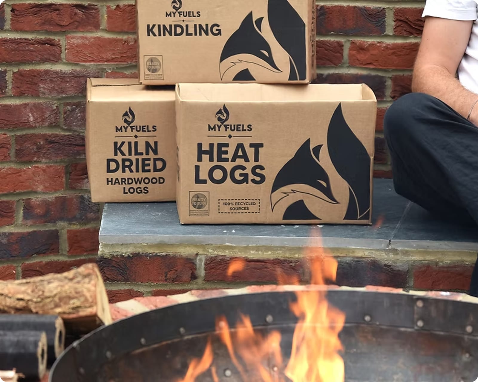
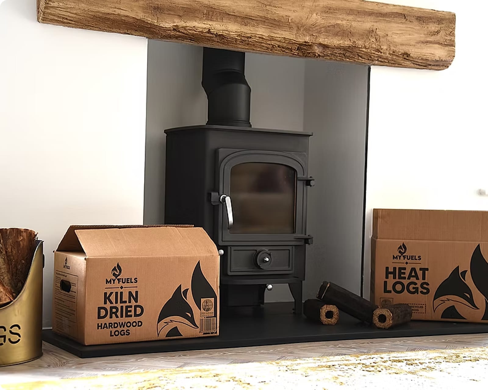
My Fuels sells practical, everyday products often perceived as “boring.” To make the brand stand out, we introduced a playful mascot—the My Fuels Fox—drawing inspiration from successful character-led campaigns such as Duracell and Gorilla Glue.
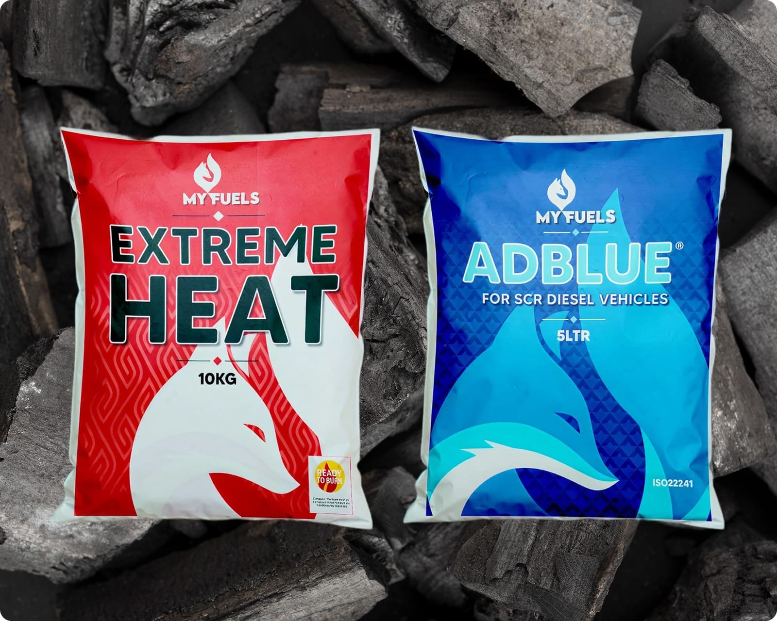
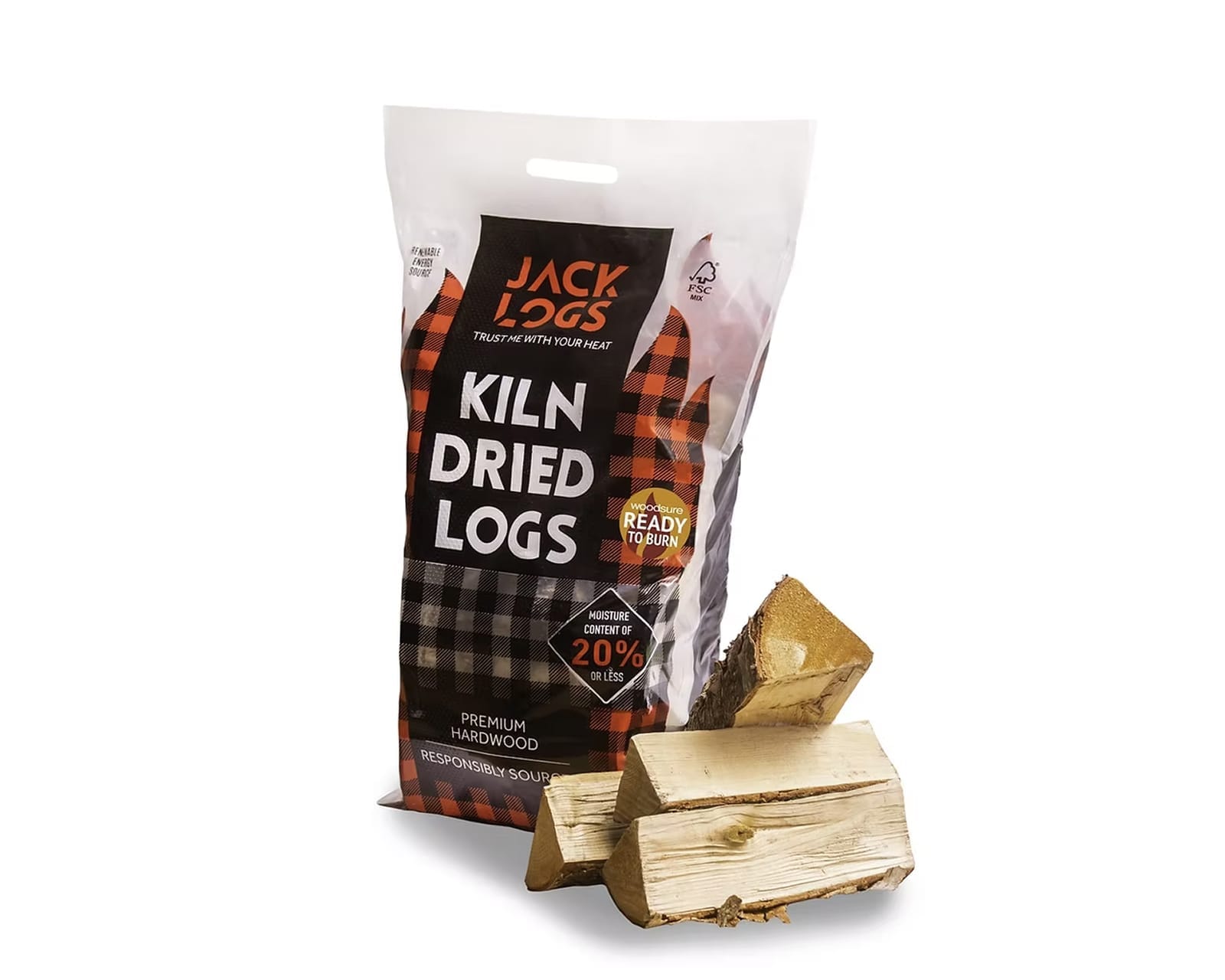
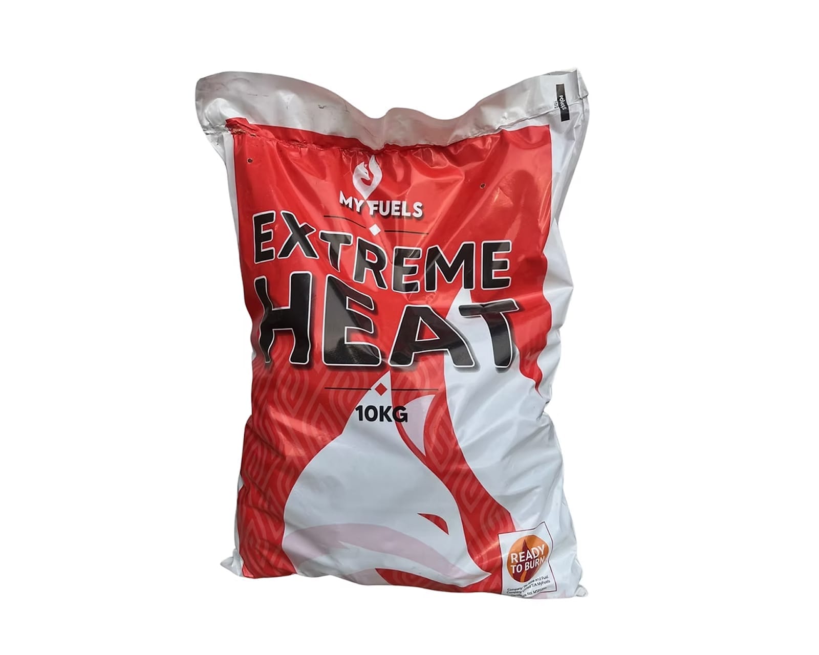
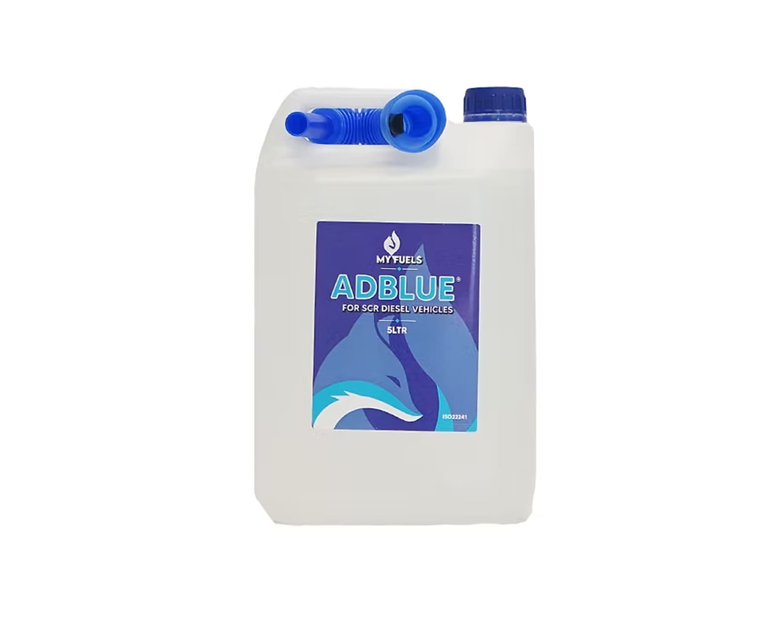
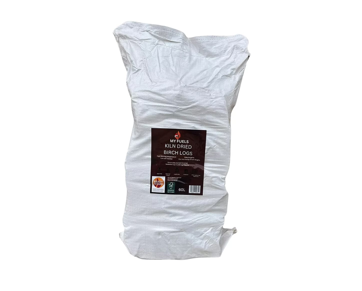
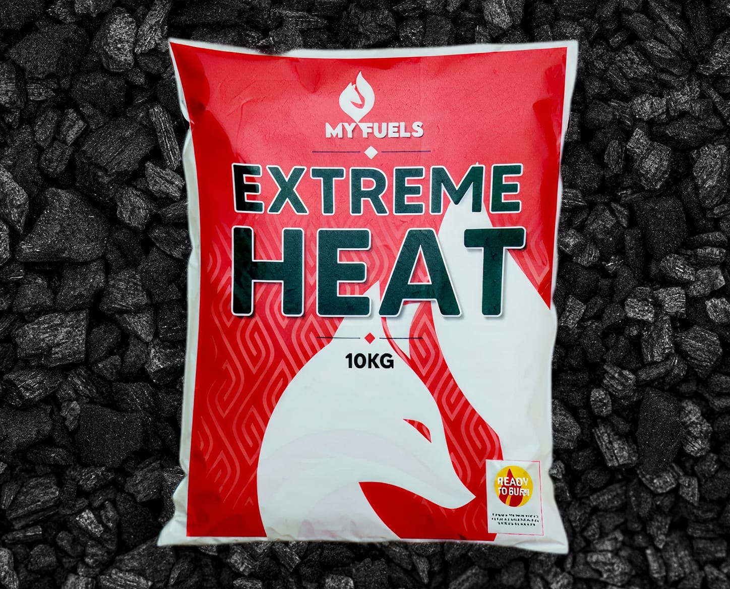
With a seasonal product range spanning winter essentials like logs and summer items such as barbeques, we implemented a colour-coded system—red for winter, blue for summer, and white for year-round products like screenwash—ensuring intuitive shelf navigation while maintaining a cohesive brand identity.
As a national supplier targeting major retailers including Asda, B&M, Esso, BP, and Tesco, My Fuels needed to appear professional, memorable, and competitive. Our brand refresh strengthened recognition across wholesale and retail channels, helping the company stand out in a crowded market.
The refreshed brand identity successfully elevated My Fuels’ market presence with a distinctive visual system that stands out against competitors on retail shelves.
We delivered a comprehensive brand refresh including logo development and 30+ product packaging designs, creating a cohesive brand experience that resonates across their entire product range.
My Fuels operates in a fiercely competitive category where strong visual impact and brand recall are essential on crowded retail shelves. The challenge was to create a flexible identity system that could stand out across seasonal product ranges while remaining instantly recognisable. The goal was a distinctive brand that sets My Fuels apart from commodity competitors with minimal shelf presence.
We conducted competitor research, developed a distinctive brand identity featuring a character mascot to bring personality to everyday products, and implemented this across the entire product range with comprehensive packaging redesigns.
Designed 12 logo concepts and completed packaging redesigns for 30+ products across seasonal ranges.
Extensive competitor analysis and market positioning research ensured the brand appealed to both corporate buyers and end consumers.
We analysed successful competitor brands to identify shelf visibility and recognition drivers. Brands including Duracell and Gorilla Glue employ distinctive character mascots, so we developed the My Fuels Fox—a friendly, personable character adding personality and memorability to utilitarian products.
We created 12 distinct logo design directions and refined through iterative feedback cycles to perfect the final identity. The new brand required functionality across retail shelves, commercial vehicles, and marketing applications.
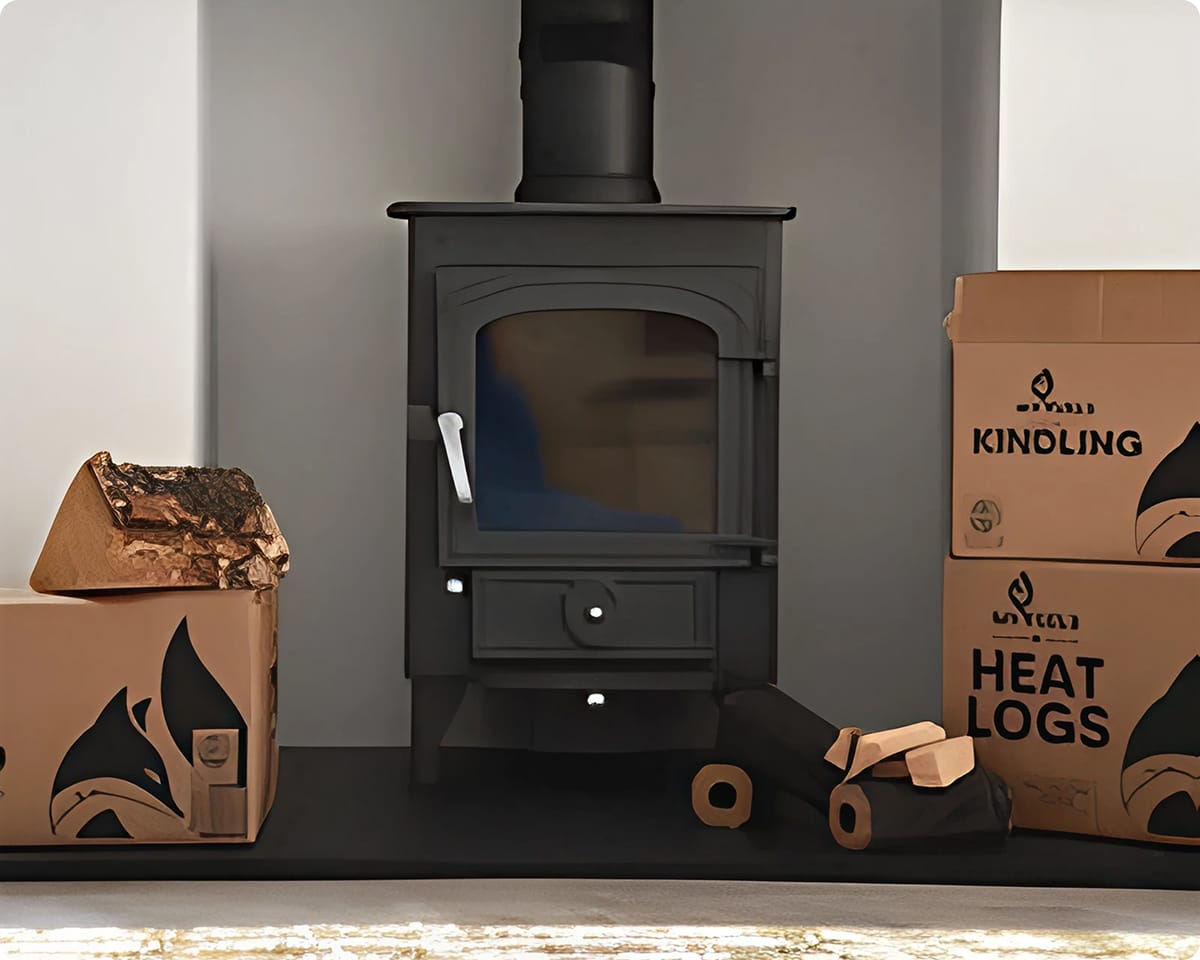
We then redesigned complete product packaging. Each product now features the My Fuels Fox mascot with strategic colour coding: red for winter products, blue for summer products, and white for year-round items. This system enables rapid consumer identification and shelf navigation.
We completed comprehensive packaging redesign across all products with the updated My Fuels brand. Over 30 product variants now feature consistent, distinctive packaging conveying professionalism while differentiating from competitors.
The design balance bold, eye-catching aesthetics with practical retail functionality suitable for supermarkets and petrol stations. All packages maintain visual coherence as part of the My Fuels product family despite individual product differentiation.
Before the rebrand, My Fuels’ packaging was inconsistent, with limited visual identity and weak shelf presence. After our redesign, the product line was unified under a bold new identity featuring the My Fuels Fox, with seasonal colour coding and 30+ cohesive designs that enhanced shelf visibility, brand recognition, and appeal across all buyer segments.

Contact Bristol Marketing Company with any enquiries – our team is on hand to assist and will respond promptly.

Lorem ipsum dolor sit amet consectetur. Egestas bibendum est ultricies in dictum nibh fusce.